Design:
- I first noticed the nicely categorised lists at the side: currently reading, the recently listened to tracks (changes to most listened artists when you click on a post, which I prefer).
- I liked the choices in rss-feeds: writing only, pictures only, links only, or a combination of the above.
- The picture feed at the top is very subtle.
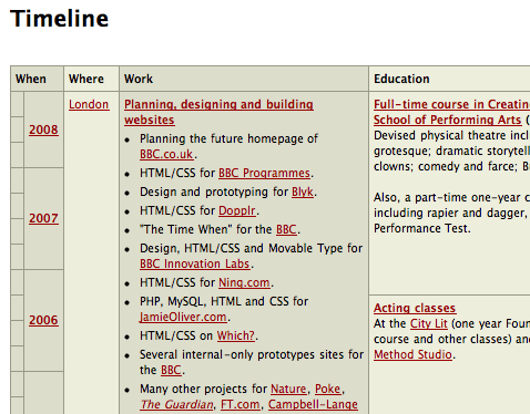
- And I love, love the time-line view of the things he's done. Best I've seen so far.

Content:
- The time-line view, once again, is excellent and shows a well-rounded background, which should also translate into better writing.
- I can mainly judge the article I originally fell on through Kottke, entitled "Graphs that lie," which makes for an interesting point.
- The video he acted in, called Manicato, is very nice though!


No comments:
Post a Comment